Menu


What’s Important to Have on Your Website in 2023
A quick search on good ol’ Google about what to have on your website in 2023 and forum posts about what features to have pop up.
And that’s the problem—hyper-focusing on features and trends.
Notice I said hyper-focused.
Knowing trends isn’t bad, but if you base what you do on trends alone and not the spirit or reason behind it, then your relevance will fade as fast as trends come and go.
How do you make sure your website, and your business in general, stay relevant in 2023?
Read the rest of this post for five simple tips.
What’s important to have on your website in 2023
1. A solid brand story
Put simply, a brand is what comes to mind when people hear about you or your business…or at least what should come to mind.
As a web designer, I often have to excavate the brands of my clients, and if their brand is wishy-washy or non-existent, it makes my job harder—which prolongs the project.
The thing is, you should already have a crystal-clear brand in your head. These are the do’s and don’ts of how your business communicates and serves people.
And spoiler alert, colours and fonts are only a part of the brand.
Need some help? Here’s a free worksheet of some basic brand questions I ask my clients before going full-force into the project.
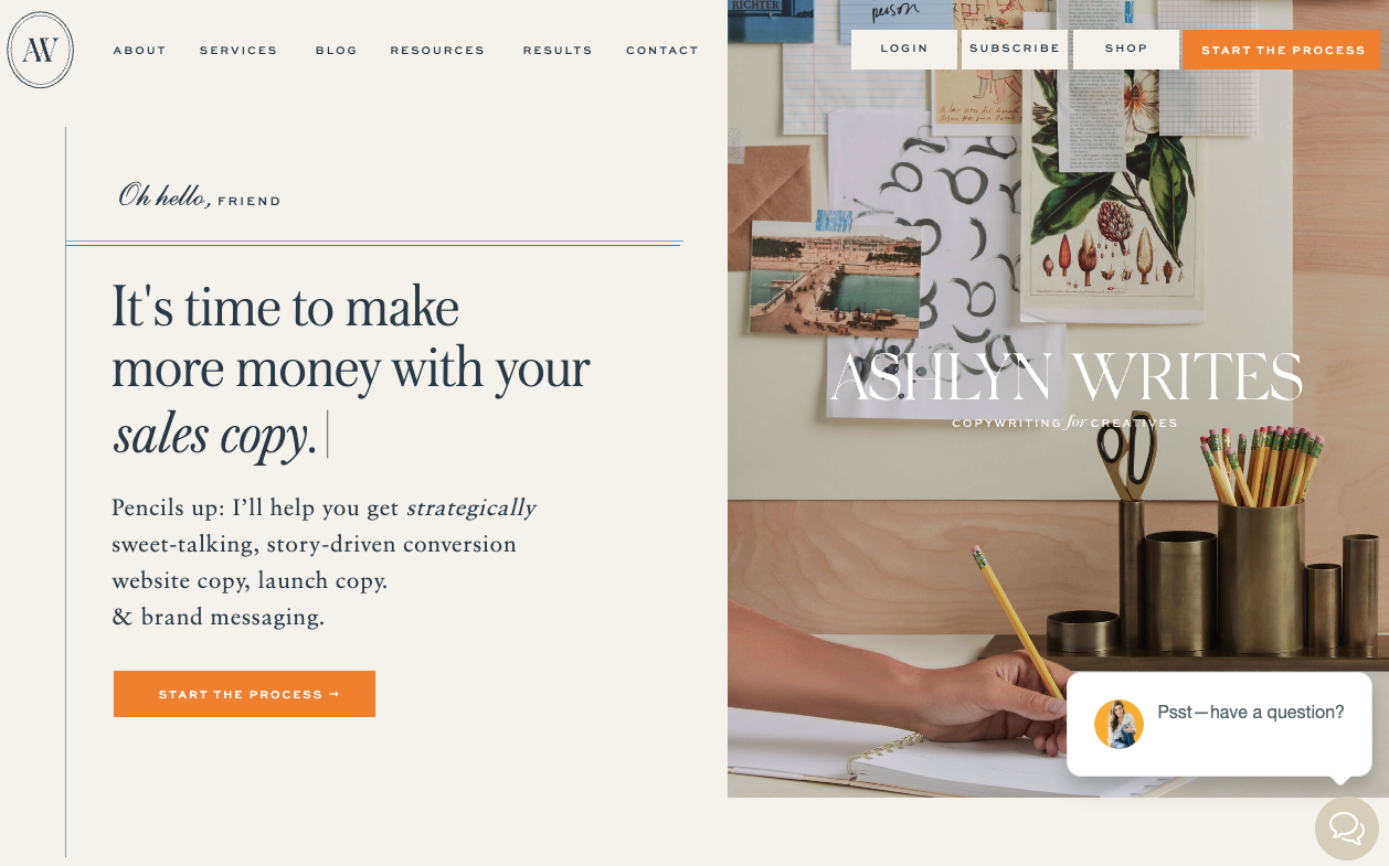
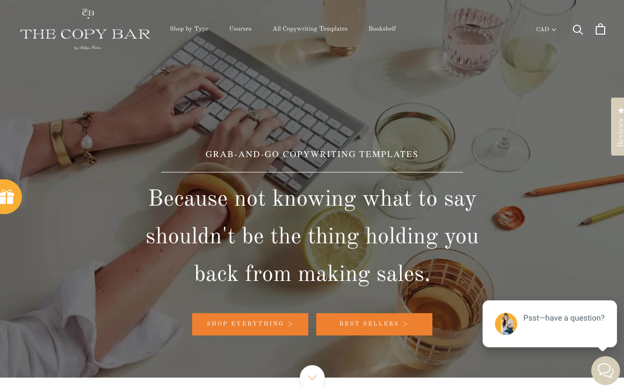
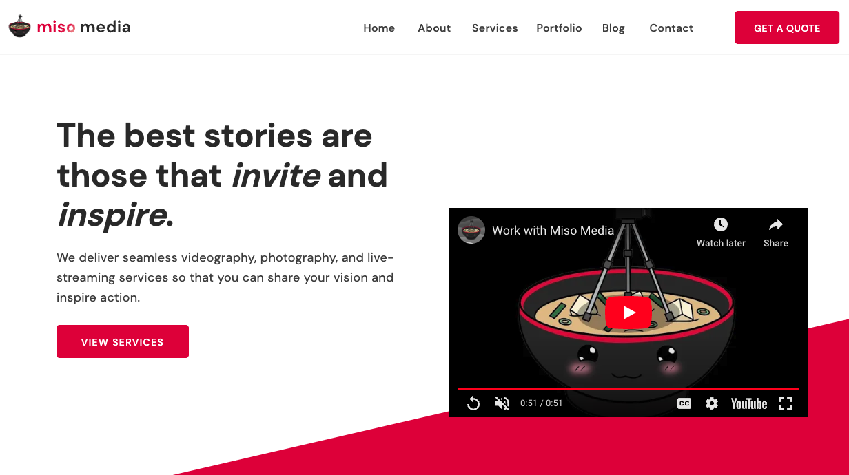
2. A clear landing page
You have less than 50 milliseconds to capture your reader’s attention (CXL).
With this, your landing page needs to clearly indicate what you do, who you do it for, and why.
Here are three examples of clear landing pages:
3. A page complete with what you offer.
If you’re currently open to work, you’ll need an UPDATED services/products page.
And if not, please indicate it on your page!
I’ve gotten in contact with a vendor for my wedding a week ago. Their work looked beautiful and I was interested in entertaining the thought of working with them.
I shot a message and within a few days, I received a message saying they’re actually not taking in clients for the foreseeable future.
If you know anything about planning a wedding, contacting vendors is basically a job on its own.
I still respect the vendor but I felt frustrated that I went through the trouble of filling out the form only to get a message that they’re not taking in clients—something that could’ve been avoided in the first place.
And the thing is, it doesn’t have to be a grand undertaking—it can be as simple as putting on a banner at the top of the page, adding a note at the top of the contact form page, disabling the Submit form, or all of the above for extra measures.
4. A contact page with ways to get in touch with you (and when).
Your contact page shouldn’t be an afterthought.
Even with most contact pages being forms with fields, having alternative ways to get in touch with you and a rough timeline of when they can expect a reply from you can set you apart from competitors.
If you’re worried about spam messages, you can include the email address on the thank-you screen.
Here’s how you can do it on Showit:
5. A blog
Okay, I’m not talking about the 2008-style WordPress blog where you document what you’re feeling that day.
I mean a blog that features topics relevant to your services, and just things that your audience might find valuable.
The more you can tailor it to the questions that people ask on search engines (aka search engine optimization or SEO), the better.
Why? Search engines like Google are more likely to recommend your post as a solution to the searcher’s problem.
Scared of SEO? No worries.
Here’s a post that can help you get started even if SEO is totally foreign to you.
6. Designing for web accessibility
Creatives, you know this.
We pour over the look of a website but not so much about how it might be perceived by people who might need accommodation.
For example, do the text on your website stand out against the background? If you’re not sure, here’s a free online tool that you can use to check.
Also, can people use their keyboard to navigate through your website?
This used to be a huge limitation with Showit but recently they rolled out an update that allows you to move through page links using your keyboard.
Showit definitely has a long way to go in terms of developing for web accessibility but this update is an awesome step forward.
For myself as a web designer, I’m working on all of these so you’re in good company. These six points can be starting points from which you determine what you need on your site in 2023.
Honest emails on brand, web design, and making your expertise land for the people who need to find you.
Emails for experts whose online presence hasn't caught up to their reputation.


